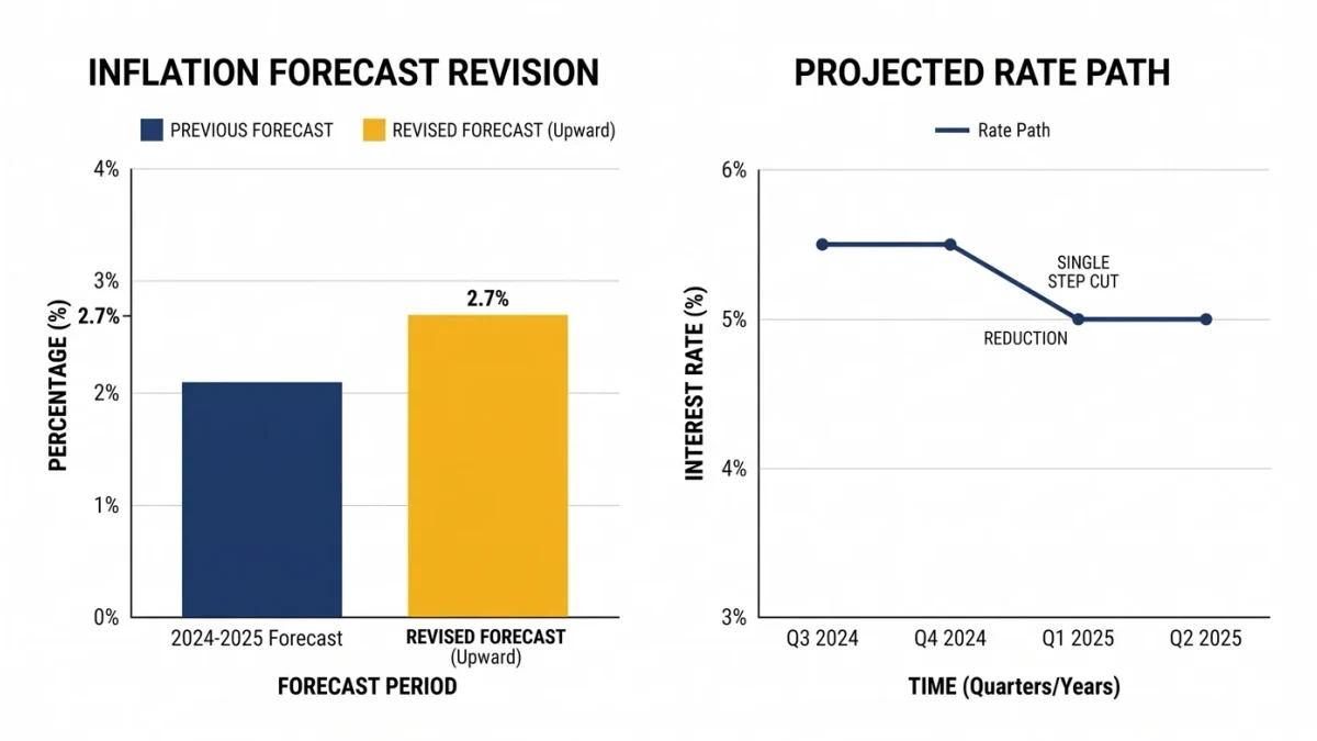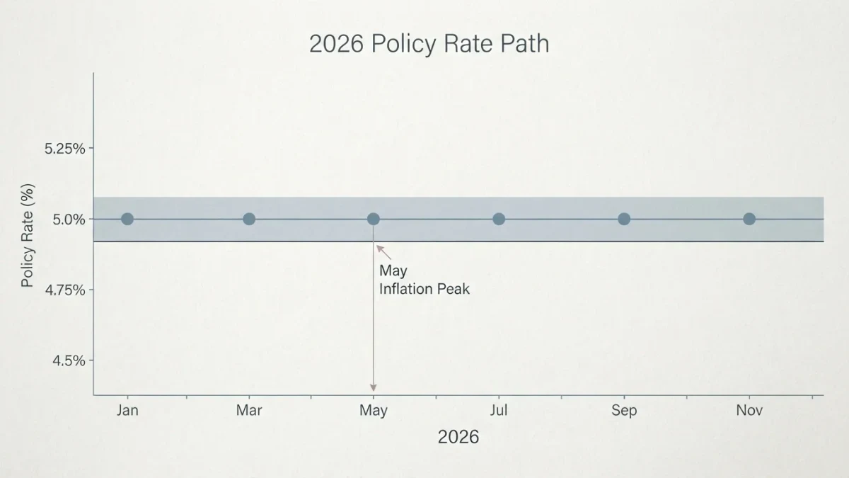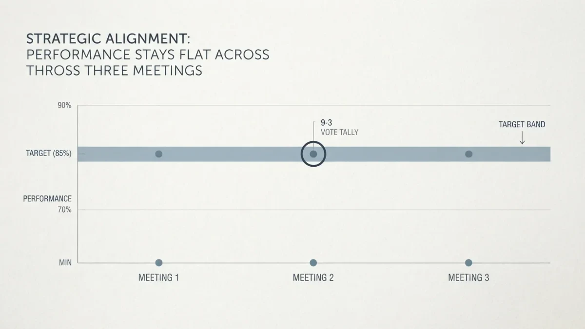

The dot plot is the chart in the Federal Reserve's quarterly Summary of Economic Projections where each of the nineteen participants — governors and regional bank presidents — places a dot for the federal funds rate they see as appropriate at year-ends ahead and in the longer run. The median dot moves markets on release day, yet the document's own accuracy record argues for humility: projections made in March 2020 for 2022 missed by hundreds of basis points, and the pandemic-era dots promised rate paths that never happened. NewsJay publishes information and education, not investment advice.
What exactly is being plotted?
Each dot is one participant's view of the appropriate policy rate — not a forecast of what rates will be, but what the participant thinks should be, given their own outlook for growth, unemployment, and inflation. The dots cluster for the current year and spread wider for years further out, because even inside one committee the disagreement compounds with time. The longer-run dot is the neutral-rate estimate — where policy settles once the economy is balanced — and its slow upward revisions across recent cycles have been among the chart's most consequential signals.
Which readings survive scrutiny?
Three. The median's direction, read release to release — the June 2026 projections landing amid a spring inflation spike told a different story than winter's disinflationary set. The dispersion — nineteen dots in a tight column signal agreement about the path; a scatter from three to five implies a committee winging it, which markets price as uncertainty. And the longer-run median — the estimate of neutral that anchors a decade of discounting, moving by fractions that headline commentary barely notices and bond markets weight heavily.
| Reading | What it tells you | Reliability |
|---|---|---|
| Median next-year dot | Committee's center of gravity | Low — changes every quarter |
| Dispersion of dots | Internal disagreement | Meaningful signal |
| Longer-run median | Neutral-rate estimate | Slow, structural, most useful |
How has the plot misled readers?
Two errors recur. Treating dots as commitments — the famous case of the 2015-2018 cycle, where the median consistently projected more hikes than materialized, earning the plot its dovish-bias reputation. And over-weighting single-quarter shifts — a one-meeting move in the median usually reflects new data the market already traded. The disciplined consumer reads the plot the way its authors present it: as a snapshot of committee sentiment at one date, explicitly conditioned on information that changes.
Why does the market care so much, then?
Because it is the committee's only collective numerical statement between meetings, and because rate expectations cascade through every asset — the two-year Treasury, mortgage pricing, equity discount rates. The release-day volatility is traders repricing the median; the long-run information content for a retirement portfolio is close to zero. Investors with horizons in decades can read the dot plot as macro literacy and stop there: no allocation decision in the published evidence traces back to a dot plot, and many expensive ones trace back to acting on one.
How should the dot plot and the press conference be read together?
The press conference is where the median's meaning gets negotiated in real time: the chair explains what moved the projections, which questions the committee weighed, and how policy officials frame the risks — context the chart cannot carry. The disciplined pairing treats the dots as the committee's arithmetic and the conference as its tone, and expects the two to disagree occasionally, since tone is communication strategy and dots are submissions by nineteen individuals. Investors who read both walk away with the same honest conclusion either component delivers alone: here is what they think today, priced accordingly.
What replaced the dot plot's role between meetings?
Speeches and interviews by committee members fill the gap — the same nineteen voices, speaking individually, and the tape of their leanings is the market's running update on where the next plot may land. The discipline for a long-term investor is identical: read speeches as sentiment telemetry, note when the tone shifts materially, and decline to reposition on any of it. The dot plot's modest lesson generalizes completely — central banking communication is abundant, and none of it is a commitment.
FAQ
When is the dot plot released?
Quarterly, with the March, June, September, and December FOMC meeting materials, alongside individual projections for growth, unemployment, and inflation. The chair discusses both at the post-meeting press conference.
Is the median a committee decision?
No — the committee votes only on the current target range. The dots are anonymous individual views; the median is arithmetic performed on those views, not a policy adopted by anyone.
Why do the dots sometimes miss so badly?
Because they are conditional projections made amid uncertainty — a shock arrives and the condition changes. The plot's own footnotes say expectations are appropriate to each participant's forecast; forecasts of shocks do not exist.
Should the dot plot change my portfolio?
It should inform understanding, not allocation. Rate paths implied by dots are sentiment snapshots; a portfolio built to survive several rate regimes has no need to position for one committee's median guess.