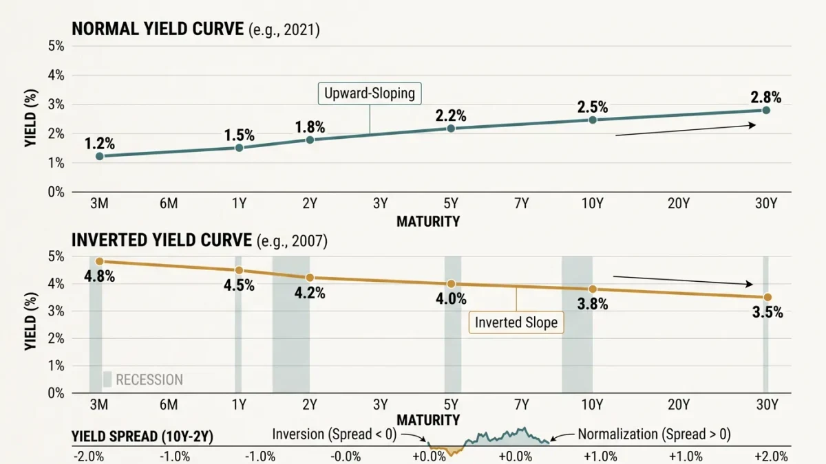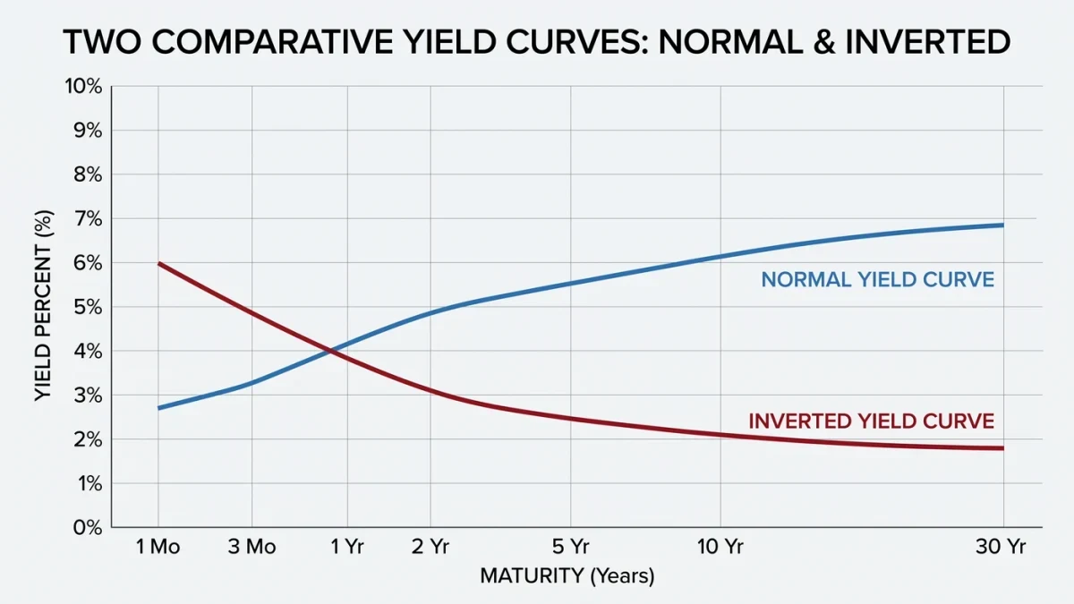
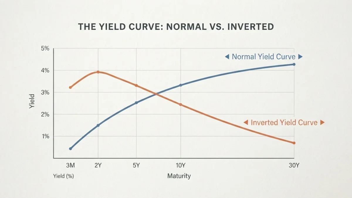
The Treasury yield curve plots the interest rates of US government bonds against their maturities, from 3 months to 30 years, and its shape summarizes what the bond market collectively believes about growth and policy. An inversion — short-term yields above long-term — has preceded every US recession of the past half-century with one false alarm in the mid-1960s, per Federal Reserve research based on data through recent decades.
What exactly is the curve measuring?
Each point on the curve is a market price: the annualized yield a buyer demands for lending to the US government for a specific term. Short rates track the Federal Reserve's policy rate almost mechanically; long rates embed expectations for growth, inflation, and policy averaged over decades. The curve's normal shape slopes upward — longer loans carry more uncertainty — and each published Treasury par yield curve on the Treasury Department's website updates the picture every trading day.
Why does inversion get the attention?
Inversion means the market expects policy rates to fall meaningfully in the future, which historically happens because growth weakens. The most watched measure, the spread between the 10-year note and the 3-month bill, has inverted ahead of each of the last eight or nine recessions, with lead times from several months to more than two years — long enough that traders who sold at the signal often missed substantial gains first. That lead-time spread is the essential caveat: the signal is reliable in direction and unreliable in timing.
How should a long-horizon investor actually use it?
Three practical readings survive scrutiny. As a context check, the curve explains why cash yields occasionally beat bond yields — an oddity that puzzles income investors during inversions. As a risk gauge, deepening inversion argues for exactly the boring disciplines: rebalancing bands, cash buffers sized to the household, and allocation set by need for risk rather than forecast. As a lesson source, each curve episode teaches how expectations get priced — the 2022–2024 inversion, the deepest in four decades, showed how long policy divergence can persist once markets and the central bank disagree.
What can the curve not tell you?
It cannot time markets, and its authority degrades when structural forces distort it: global demand for long-dated collateral, central-bank bond buying, and term-premium shifts can flatten or steepen the curve without any change in the growth outlook. A flat curve from heavy pension demand means something different from a flat curve from rate-hike expectations. The honest read treats the curve as one instrument on a panel, cross-checked against credit spreads, employment data, and earnings trends.
| Curve shape | Typical market interpretation | Historical follow-through |
|---|---|---|
| Steep upward | Growth and inflation expected | Expansionary periods |
| Flat | Policy tightening or distortions | Transition — ambiguous |
| Inverted | Rate cuts expected; growth doubt | Recession followed in 8 of 9 episodes |
Does an inverted curve mean bonds are mispriced?
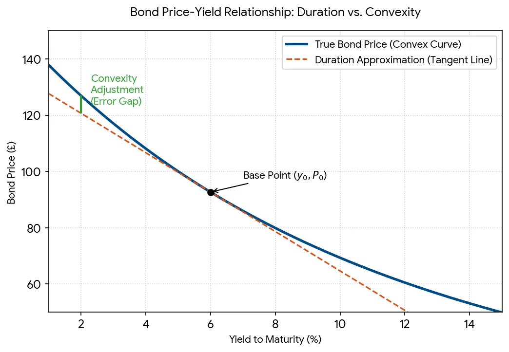
No — it means the price of future money differs from the price of present money, and both can be fair. Investors holding individual bonds to maturity care about the yield locked at purchase, not the path of rates before maturity. For fund holders, duration risk — how much the fund's value moves when rates change — matters more than the curve's shape on any given day.
Which spread should you actually watch?
The 10-year minus 3-month pair carries the best statistical record in the recession-prediction literature, and the Federal Reserve maintains the data publicly; the 2-year-10-year spread is the market's favorite and the headlines' default, and the two can disagree for months at a time — famously diverging in 2022-2023, generating conflicting obituaries. The disciplined answer is to pick one measure, learn its history, and treat the other as a cross-check rather than a referee. Investors quoting whichever spread confirmed their prior that week are not reading the curve; they are decorating it.
FAQ
What is the yield curve inversion signal?
When a long-term yield, commonly the 10-year note, falls below a short-term one such as the 3-month bill, the curve is inverted. The signal has preceded every US recession of the past half-century with one false alarm, but lead times have ranged from months to over two years.
Where can I see the curve myself?
The Treasury Department publishes daily par yield curves on its website, and Federal Reserve data tools chart the classic spreads over decades. Both are primary sources, free, and updated with each trading day.
Should I sell stocks when the curve inverts?
The evidence does not support that. Equities have often risen for a year or more after inversion before any downturn, and missing those months damages long-run outcomes severely. The disciplined response is reviewing allocation and buffers, not liquidating.
Why do cash rates sometimes beat 10-year yields?
Because short rates follow Fed policy, which is high during tightenings, while long rates price averages over decades. When the market expects tightening to be temporary, long yields sit below cash yields — the defining mechanic of inversion.